Accordion
A vertically stacked list of interactive headings with smooth animations and customizable content
collapsibleanimatedinteractivefaqaccessible
Installation
Install dependencies
npm i @radix-ui/react-accordion clsx tailwind-merge lucide-reactAdd util file
lib/utils.ts
import { ClassValue, clsx } from "clsx";
import { twMerge } from "tailwind-merge";

export function cn(...inputs: ClassValue[]) {
  return twMerge(clsx(inputs));
}
Add animation to tailwind.config
tailwind.config.js
module.exports = {
  theme: {
    extend: {
      keyframes: {
        "accordion-down": {
          from: { height: "0" },
          to: { height: "var(--radix-accordion-content-height)" },
        },
        "accordion-up": {
          from: { height: "var(--radix-accordion-content-height)" },
          to: { height: "0" },
        },
      },
      animation: {
        "accordion-down": "accordion-down 0.2s ease-out",
        "accordion-up": "accordion-up 0.2s ease-out",
      },
    },
  },
}
Copy the source code
components/aesthe-ui/accordion/accordion.tsx
"use client"

import * as React from "react"
import * as AccordionPrimitive from "@radix-ui/react-accordion"
import { ChevronDownIcon } from "lucide-react"

import { cn } from "@/lib/utils"

function Accordion({
...props
}: React.ComponentProps<typeof AccordionPrimitive.Root>) {
return <AccordionPrimitive.Root data-slot="accordion" {...props} />
}

function AccordionItem({
className,
...props
}: React.ComponentProps<typeof AccordionPrimitive.Item>) {
return (
<AccordionPrimitive.Item
data-slot="accordion-item"
className={cn("border-b last:border-b-0", className)}
{...props}
/>
)
}


function AccordionTrigger({
className,
children,
...props
}: React.ComponentProps<typeof AccordionPrimitive.Trigger>) {
return (
<AccordionPrimitive.Header className="flex">
<AccordionPrimitive.Trigger
data-slot="accordion-trigger"
className={cn(
  "focus-visible:border-ring focus-visible:ring-ring/50 flex flex-1 items-start justify-between gap-4 rounded-md py-4 text-left text-sm font-medium transition-all outline-none hover:underline focus-visible:ring-[3px] disabled:pointer-events-none disabled:opacity-50 [&[data-state=open]>svg]:rotate-180",
  className
)}
{...props}
>
{children}
<ChevronDownIcon className="text-muted-foreground pointer-events-none size-4 shrink-0 translate-y-0.5 transition-transform duration-200" />
</AccordionPrimitive.Trigger>
</AccordionPrimitive.Header>
)
}

function AccordionContent({
className,
children,
...props
}: React.ComponentProps<typeof AccordionPrimitive.Content>) {
return (
<AccordionPrimitive.Content
data-slot="accordion-content"
className="data-[state=closed]:animate-accordion-up data-[state=open]:animate-accordion-down overflow-hidden text-sm"
{...props}
>
<div className={cn("pt-0 pb-4", className)}>{children}</div>
</AccordionPrimitive.Content>
)
}

export { Accordion, AccordionItem, AccordionTrigger, AccordionContent }
Interactive Image Accordion
Aesthe-UI provides a set of pre-built, accessible, and responsive components.
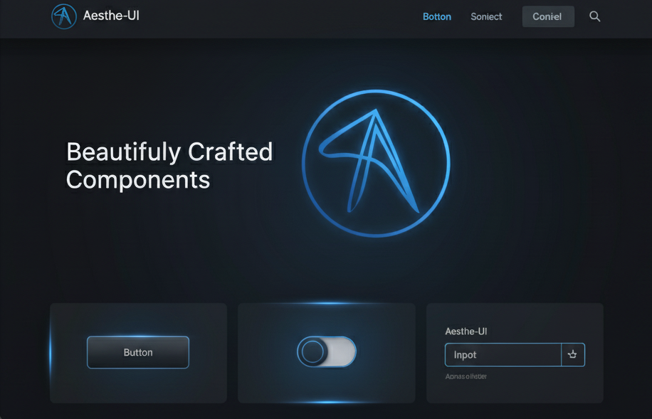
Beautifully Crafted Components
Aesthe-UI provides a set of pre-built, accessible, and responsive components.
Customization
Accordion Types
Control how many items can be open at once:
// Single - only one item open at a time
<Accordion type="single" collapsible>
  {/* items */}
</Accordion>

// Multiple - multiple items can be open
<Accordion type="multiple">
  {/* items */}
</Accordion>
Default Open State
Set which items are open by default:
// Single type
<Accordion type="single" defaultValue="item-1">
  {/* items */}
</Accordion>

// Multiple type
<Accordion type="multiple" defaultValue={["item-1", "item-2"]}>
  {/* items */}
</Accordion>
Custom Styling
Customize the appearance with className props:
<AccordionItem className="border-none bg-secondary/50 rounded-lg px-4">
  <AccordionTrigger className="hover:text-primary text-lg hover:no-underline">
    Custom styled trigger
  </AccordionTrigger>
  <AccordionContent className="text-muted-foreground">
    Custom styled content
  </AccordionContent>
</AccordionItem>
Controlled State
Manage the accordion state externally:
const [value, setValue] = useState("item-1");

<Accordion
  type="single"
  value={value}
  onValueChange={setValue}
>
  {/* items */}
</Accordion>
Props
Accordion
| Prop name | Type | Description |
|---|---|---|
| type | "single" | "multiple" | Determines if one or multiple items can be open |
| collapsible | boolean | Whether items can be collapsed (single type only) |
| defaultValue | string | string[] | Default open item(s) |
| value | string | string[] | Controlled open item(s) |
| onValueChange | (value) => void | Callback when open items change |
| className | string | Additional CSS classes |
| disabled | boolean | Disables all items |
AccordionItem
| Prop name | Type | Description |
|---|---|---|
| value | string | Unique identifier for the item (required) |
| className | string | Additional CSS classes |
| disabled | boolean | Disables this specific item |
AccordionTrigger
| Prop name | Type | Description |
|---|---|---|
| className | string | Additional CSS classes for the trigger |
| children | React.ReactNode | Content of the trigger (usually the question/title) |
AccordionContent
| Prop name | Type | Description |
|---|---|---|
| className | string | Additional CSS classes for the content wrapper |
| children | React.ReactNode | Content to show when expanded |
Accessibility
The accordion component is built on top of Radix UI and includes:
- Keyboard navigation: Use
Tabto focus,SpaceorEnterto toggle, arrow keys to navigate - ARIA attributes: Proper
aria-expanded,aria-controls, andaria-labelledbyattributes - Focus management: Visible focus indicators and proper focus order
- Screen reader support: Announces state changes and content
Use Cases
- FAQs: Perfect for frequently asked questions sections
- Navigation menus: Organize nested navigation items
- Feature lists: Display product features with detailed descriptions
- Settings panels: Group related settings in collapsible sections
- Step-by-step guides: Progressive disclosure of instructions